Art in the Home

It’s been a long time since I posted anything. The pandemic was a huge distraction, and over time I’ve mostly shifted these kinds of updates to my instagram. But I like for there to be a little history on my website so that people who find me here can get a better sense of what I do. This post is an acknowledgment of how special it is for artists to see where their work ends up. Here my painting Murmur Over the Green, a large triptych, has been installed in the dining room of a beautiful midcentury modern home. My husband and I have a lot of artwork on our walls - our own, plus paintings we’ve been gifted and ones we have bought. So I understand what it means to have artwork in your house and how it brings life and energy to a home. I’m so appreciative of collectors, people who feel a connection to my work enough to want to live with it. Not only is that such a special feeling for me personally, people who love and collect art make it possible for artists to keep doing what we love to do.

Shades of Blue for a Beacon Hill Brownstone

Reposted from Abigail Ogilvy Gallery

THE STORY - These past 6 months we have had the pleasure of working on a commission with a couple located in Beacon Hill. They came into the gallery during our Collected Stories exhibition and by chance had the opportunity to meet Holly Harrison, one of our represented artists who was on view.

image-asset.jpeg

THE ARTIST - Holly Harrison’s latest work, Color Fields, relates sections of color with elements of mixed media. In this new series, the bands of color serve as the subject, contrasting with her previous work that was mostly image-based. A crucial element to Harrison’s work is the mixed media component, giving each artwork texture, depth and most importantly: an imbedded story. Often the layers include old shopping lists, vintage comics, book and magazine pages, printed papers, junk mail, her daughter’s early doodles, and pieces of her husband’s works on paper. These components are covered with a wash of paint, joining the disparate pieces together while also obscuring their content. After discussing their shared love for comic books and New York City, the couple decided to commission two artworks by Holly for their dual fire places.

COMMISSION PROCESS – For this project, Harrison wanted to ensure the work was a perfect balance of her artistic expression and a representation of the clients’ lives and family. She spent time getting to know them, looking at selections from their vintage comic book collection as well as drawings and homework samples by their children that the couple had assembled for her to use. She also searched online and in vintage shops for antique prescription bottle labels and old medical illustrations of the brain as an ode to the clients’ careers in medicine. In additional to the personalized collage elements, the clients also hoped the finished works would aesthetically match their home in shades of blue.

For every commission there is a conversation between the artist and clients where the artist gets a sense of the client’s preferred style, size, and scope of the project. Once the artist is about 75% complete with the artwork, they share progress photos with the clients which allows one or two rounds of feedback (or they say they love the progress and have no changes!). From there, the artist finishes the work and we set up delivery and installation.

OUR ADVICE - Commissions are a wonderful way to acquire an artwork specifically customized for your space. If you love a certain piece, but it isn’t quite the right size for your home - always ask the gallery if there is the option to create a new work in the size you need.

BEFORE:

image-asset-1.jpeg


AFTER:


Edited_IMG_0229.jpg


The Gift of Art

My earliest forays into art making were always around gifts for friends and family. I loved spending time thinking about the person I was making a piece for, trying to capture something special about them and imagining their pleasure seeing it for the first time.

The impulse to connect to someone through art is cleverly described by the poet Frank O’Hara, who was a curator at the Museum of Modern Art in the 1950s and 60s and friends with many of the seminal painters of that era. In “Personism: A Manifesto”, he writes in part: Personism “was founded by me after lunch with LeRoi Jones on August 27, 1959, a day in which I was in love with someone (not Roi, by the way, a blond). I went back to work and wrote a poem for this person. While I was writing it I was realizing that if I wanted to I could use the telephone instead of writing the poem, and so Personism was born. It's a very exciting movement which will undoubtedly have lots of adherents. It puts the poem squarely between the poet and the person, Lucky Pierre style, and the poem is correspondingly gratified. The poem is at last between two persons instead of two pages.” The piece is tongue in cheek but it hits on a real impulse - that artists and poets often seek to connect with others through their creativity and that artwork is most alive when it is being shared. (For the whole text, click here.)

My early forays eventually led to deeper investigations and I began to make art for its own sake. But I still value the relationship between a piece of art I have made and the viewer standing before it. To me, that is where art lives, when someone is engaging with it. And in that spirit, I still love gifting people with my artwork as a way of expressing my feelings of connection with them. May was a big birthday month this year, with my sister Linda having a round-number birthday and my daughter Mira’s BFF since preschool, Katie, turning 16. Here they are with their new artworks. Happy birthday to both of them!

From left: Linda, Mira and Katie.

From left: Linda, Mira and Katie.


This and That

A few cool things that have been percolating this year:

During the time that Collected Stories was up at my gallery in Boston, there was a performance event that featured poetry and dance against the backdrop of the show (my paintings and photographs by Kristina McComb). We were out of town, so I wasn’t able to attend the sold-out show, but it was really cool to see photographs and a video of the dancers in the space with the artwork. I came across this interesting review in an online publication called Aesthetics Research Lab. To read it, click here

My work was juried into the Mass Art auction again this year. It’s a wonderful show that raises money for art scholarships and I always love going to see how they manage to hang literally hundreds of artworks on the walls. It’s truly amazing to see how many artists donate work for this cause. To see what’s for sale or to buy tickets to the auction, click here

I’ll also be a featured artist at a preview event at the Mass Art organized by the Massachusetts State Committee of the National Museum of Women in the Arts in partnership with the Harvard Business School Association of Boston. The gallery director at AOG, Allyson Boli, will be speaking at the event and then a few of us artists from the gallery will about our work and process . For more details, click here

I found this photo on the Bakalar and Paine galleries IG promoting the show: My painting Harlem birds is the striped one on the top row, to the left of the round striped one by Jeffrey Heyne..

Image-1.jpg


A Night of Poetry and Art

Recently, my daughter, Mira, and I attended the opening of The Language of Art, my first group show at Edgewater Gallery in Middlebury, VT. The opening was fantastic. The gallery collaborated with a local group of writers, the Spring Street Poets, by having this talented group create original work in response to different paintings in the show. The other artists in the show are: Holly Friesen, Robert O’Brien, Victoria Blewer, Margaret Gerding, and Liz Hoag. I’ve included images and text of the poets who wrote about my work here. It was quite a moving experience to hear the poets’ thoughtful responses to the different paintings.

Mary Pratt reads Birds on Wires, her lovely riff on my painting Treble Clef (on the wall behind her).

Mary Pratt reads Birds on Wires, her lovely riff on my painting Treble Clef (on the wall behind her).

Birds on Wires


After making music for hours—

practicing the piano, 

singing with a chorus—

I can see tunes even when 

I close my eyes—


black notes on thin lines, 

alphabet of melody. 

I’m teaching my grandson

to see the patterns: 

Look! I tell him, 


those dots all in a line 

are the same

sound. Shall we

sing it?He is so 

young that learning 


is not a chore. 

He looks and laughs. 

Later, when I see birds 

on wires, I can’t help 

but hum the score.


—Mary Pratt 


Ray Hudson reads View from a Bus, a poem about moving on, inspired by my painting Soft Landing (on the wall beside him). .

Ray Hudson reads View from a Bus, a poem about moving on, inspired by my painting Soft Landing (on the wall beside him). .

View from a Bus 


It’s a three-day holiday and when you get back 

you’ll notice I’ve done the dishes

and vacuumed the living room. You’re good 


at making deductions. I left the Aran sweater,

one of the matched pair your mother gave us, 

somewhere in the bedroom. I took 


two red stones and my favorite cup. Outside 

thirteen birds ascend with predictability 

into a sky mirrored in steel or mica or tinsel 


and mud. They pause in midflight, proof 

of what the unencumbered eye can do, can break free, 

rest in mid air, on the thin wire that carries 


the voices of parents and lovers, those pre-recorded 

solicitations. Soft landings are still landings. 


—Ray Hudson 


Kari Hansen reads Stay a Little Longer next to my painting with the same title. I love how her poem really inhabits the painting.

Kari Hansen reads Stay a Little Longer next to my painting with the same title. I love how her poem really inhabits the painting.

.
Stay a Little Longer


I want the birds to stay 

I want the sun to stay 

I want the clouds to stay 

I want the blue to stay 

I want the day to stay 

I am a fiend of wanting. 


This moment, this should stay. 


Those moments. 


The hurl of a goodbye, the final

page, the end of you, 

of us, of living, of moving, 

of feeling full. 

Empty hands. Empty heat. 

That’s when the me in me 

might become dismal. 


But, I am willing to stand aside, 

choose my reactions. 

Be willing to alter my perceptions. 

Become nonjudgmental. 

Buddha-like. 

Elevate. 


I await enlightenment… 


Who am I kidding? 


—Kari Hansen  


Q&A with The Addison Independent’s Christopher Ross 

I recently spoke with Christopher Ross of TheAddison Independent, a family-owned independent newspaper in Middlebury, VT. He interviewed me for an article on The Language of Art, a group show at Edgewater Gallery that I’m a part of. The show has brought together poetry and visual art by having poets write original verse in response to different paintings in the show. The texts have been posted in the gallery next to the paintings that inspired them. As someone who studied poetry for many years, I’m especially excited to be part of this show. 

Christopher was only able to use a small part of our conversation, but you can check out the article here. And I’ve included our exchange in this blog entry. 

Christopher Ross: Theresa Harris (the director at Edgewater Gallery) told me you were a writer/poet before you took up painting—how has that work affected your painting?

Holly Harrison: My work is definitely affected by my training as a poet. I am drawn to structure, so when I began to work visually, I made paintings that were largely composed of horizontal bands of pattern, color and imagery. I thought of these bands as poetic stanzas, each one focusing on a single idea or image while also being part of a larger narrative. Juxtaposition is important in poetry, and so for me, there is meaning in how things are placed in relation to each other. This gives the viewer a chance to think about those placements and explore the relationships between things. I’m still working like this, only the work I’m doing right now is more abstract. But it’s the same idea: create the structure, then find ways to work creatively within it. 

CR:  Theresa said your work is horizontal, linear and could almost read as a poem—do you feel that's true in some way? What else would you add?

HH: I would agree with that. I became interested in bird imagery through my love of the poet Wallace Stevens, in particular the poem “Thirteen Ways of Looking at a Blackbird”. So early on in my visual work, I included a lot of bird references. Eventually this led me to focus more on the birds themselves, on how wild and unknowable they are even as they are completely familiar and integrated into the everyday. A lot of the linear bird paintings in this show are from this series. These paintings are less obviously striped, and they focus more on a single image, but I think the poetry comes in through the rhythms of the horizontal lines and the way the disparate materials come together to create an integrated visual whole.  

 
CR:  Did the idea that poems could be displayed alongside your work change your approach to any of the work?

HH: Not really since these are all paintings that I had already made. But Theresa and I worked together to choose pieces that would work well for this show. And I can’t wait to see what poems are going to be paired with the work. 

CR: What do you think of the whole painters/poets idea?

HH: I love the idea for this show! Not only is it a great fit for my work, it’s also a lot of fun to mix things up. I think so many interesting dialogues can come out of mixing genres in a show. 

For more information about the gallery and this show (the opening is Friday, April 5, 5-7pm), click here


Q&A with Abigail Ogilvy

Abigail Ogilvy: In your artist statement, you discuss the collage elements, but don't explain how/when you decide to put them into the work. If would be helpful to know why do you choose certain collage elements? 

Holly Harrison: This is an interesting question. There are probably a few different things happening.  

I think a lot about how much paper garbage there is in the world and all the postcards, flyers, junk mail, etc. that come into the house. So many resources go into creating this “stuff”, and I mostly just throw it into the recycling bin without looking at it. I decided to bring some of it into my studio practice by incorporating it into the painted/altered collage surfaces I’ve been creating.  

Along with meaningless paper junk, there’s also a lot of meaningful paper around. My daughter’s old drawings that I can’t bear to throw out (even though I have SO many of them), postcards from art shows, maps from places I’ve been, beautiful printed papers I’ve collected or that people have given me, vintage books and some old comic books (Jim and Mira both love old comic books and sometimes damaged or “not valuable” ones make their way into my collage stash), that sort of thing. 

And then there are random paper scraps that seem to proliferate everywhere, especially in my purse and on the dining room table—shopping or to do lists, Mira’s homework (lots of math equations), my husband’s notes for his gym workouts, etc. The other day I found a piece of paper on which I had written “retro futurism”. Why did I do that? I can’t even remember. I’m drawn to these random scraps and decided they would be interesting in the mix of papers I’m using.  

Because I’m washing most of the collage elements with white paint (sometimes other colors), I can use pretty much anything since it’s just there as a hint. The paint unifies everything, making it possible to join together lots of random things. It’s like a pool of memories–some things are more visible, others are pretty deeply hidden. I’ve always been curious about how memory works. Your brain can hold so many things; it’s interesting to me that along with remembering important or moving experiences, our brains also hold onto random, even meaningless things. 

When I’m composing the white collage fields, I’m working pretty intuitively. Generally I’m choosing from painted papers that I have previously created, so I’m just thinking about what looks interesting and finding relationships between the elements. Sometimes the layouts sort of present themselves to me and other times it takes a long while for me to get everything to a place where it feels like it’s working. I try not to have an agenda when I’m moving the papers around and instead am responding to the materials and to the hints of narratives that start to come together. 

AO: Why did you move away from imagery? In the artist statement you ask, " How do you create meaning when you are not working with images? " What made you interested in this topic? What caused this transition?

HH: I wanted to stretch myself. I had been working with bird imagery for a lot of years, and I wanted to do something different. When I’ve been working in a certain vein for a while, I can get into habits: I’ll know that certain colors will look good together or adding a particular collage element will be visually successful. But I feel kind of lazy when that happens, like I’m relying on easy solutions. Maybe it’s because I got a late start as a visual artist, but I don’t want to be complacent, I always want to be learning and moving things forward or going deeper. 

I tried out a few different things and have some ideas on the back burner, but there wasn’t a subject per se that felt as compelling to me as the birds had. But I did find that I was really interested in the idea of structure and how it relates to meaning, which is something that comes out of my background in poetry. Even though I’m not a conceptual artist (at least not yet), I enjoy the thinking that goes into creating a piece or a new body of work. Setting aside image allowed me to focus on the conceptual part of making a painting. And thinking more deeply about how I build a composition led me to questions of meaning and abstraction. Even though finding my way into the process took a long time, I feel the work that I am making now is both an extension of previous bodies of work (it’s still recognizable as mine) and also references poetic structure and process. 

AO: In terms of the color fields, did you ultimately decide they are empty, or are they full? You ask the question, but then how do you ultimately feel it impacts the work?

HH: To me, this body of work is more about asking questions than it is about answering them. I hope (maybe even am counting on) that the viewer will have their own thoughts and questions as they engage with the work. In my earlier paintings, I liked using visual elements that could be read as multiple things—a long horizontal line with tabs of vertical collage might read as a fence, a zipper, birds on a wire, etc. The brain likes to find meaning even where there is no one intended meaning. This is similar to how poets use language, where meaning is relative and the role of the reader is to interpret and interact with what is there. So that’s something I’m aware of when I’m working, and it’s something I like to play with, this idea that meaning can and will change, depending on what the viewer is bringing to a piece.  

install4.gif

Collected Stories

I’m excited to announce that I’ll be in a two-person show with a wonderful photographer, Kristina McComb, at Abigail Ogilvy Gallery from December 19th to February 17th. Kristina is showing new work from a series that she has been creating at the Boston Athenaeum and I’ll be showing new paintings I’ve been working on in the studio. The opening is during SoWa’s First Friday on January 4, 2019, from 6-9pm.

The paintings in Collected Stories are a new direction for me. My previous work was image-based: stacks of recognizable places and objects rendered in loosely striped formations, allowing for narrative connections to resonate across and between them. Later, I focused more on a single dominant image, often bird-related, with painted and collaged stripes adding energy and rhythm. My new work is a return to using stripes as structure, only now I’m stacking and relating fields of color and collage. The collage is a mix of things both random and meaningful that have been obscured with layers of paint: old shopping lists, vintage comics, book and magazine pages, printed papers, junk mail, my daughter’s early doodles, pieces of my husband’s works on paper, etc. (In the studio, nothing is safe.) Pulled from many different places, these elements bring with them a sense of story. The wash of paint acts to join the disparate pieces and also to obscure their content, so that what remains is more of an impression or hint, asking the viewer to look more closely.

Art for Good

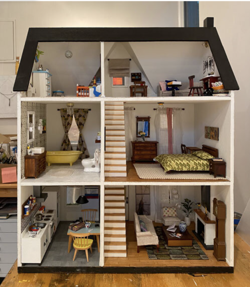
One of the nice things about being an artist is that you can hide away in your studio working on art but still be a part of something bigger by donating your artwork to a good cause. A few times a year, I get asked to either donate a painting or to make something (painted furniture, birdhouses, kid crafts) to support a cause. Last year I renovated a friend’s old dollhouse (from her childhood) and filled it with tiny painted furniture and original artwork. It was really fun to bring the dollhouse back to life, and I ended up donating it to an auction fundraiser for Household Goods in Acton, MA. They are a terrific organization with a simple mission: they collect furniture and household donations from people who don’t need them and distribute them to individuals or families that do.

I’ve also donated to a number of art non-profits like Concord Art, Attleboro Arts Museum and the Zullo Gallery. I’m a big fan of these organizations for the educational work they do and for the opportunities they offer artists of all levels to share their work. Studio art is a solitary pursuit, so connecting with a non-profit (or several) can be a great way for artists to be part of a larger art community.

My piece “Something Blue” was accepted into the Artcetera Boston auction this year. This was an early Strata painting, and it was one of those pieces that never fully worked. So a couple of years after thinking it was finished, I went back into it and totally reworked it. And then recently, a poet named Matthew Goff wrote a poem about it and posted it on Instagram. How cool is that? It feels great to know that if this work sells at the auction, not only will it be going to a new home, but it will support the work of the AIDS Action Committee.

17778eb62213c6abc0b56e4f79545096j.jpg

Better late than never...

My new series got a mention in the Improper Bostonian a couple of weeks ago! Just back from traveling, so posting it now.  

By George

I've been working out some ideas for a new series on extinction/endangerment. The first completed piece will be part of the summer show at Abigail Ogilvy Gallery. I'll be sharing the walls with some incredible artwork by Ola Aksan, Adria Arch, Kate Holcomb Hale, Michael Gordon, Kristina McComb, Marie Najera and Julia S. Powell. 

The title of my new piece references George, the last male passenger pigeon, who died in captivity at the Cincinnati Zoo in 1910. 

By George, 18" x 18", mixed media on wood panel

By George, 18" x 18", mixed media on wood panel

Inhabiting Words

Finally got the new show I'm co-curating installed this week. It's a big show, ten artists in four galleries at Concord Art. Amazingly everything came together despite a super tight installation window. Wonderful opening reception last night, lots of great comments, people milling around, jazz in the garden, happy artists. Very satisfying. 

The upstairs gallery at Concord Art. From left: Julia Csekö, Leslie Jackson, Lesley Dill, Deb Todd Wheeler, Squeak Carnwath and Andrew Witkin. 

The upstairs gallery at Concord Art. From left: Julia Csekö, Leslie Jackson, Lesley Dill, Deb Todd Wheeler, Squeak Carnwath and Andrew Witkin. 

Mass Art Auction Opening Reception

My husband and I stopped by the Mass Art Auction opening reception last night. It was amazing to see the walls covered from top to bottom with so much terrific artwork. And there's an impressive array of wonderful art in the Live Auction - big beautiful pieces by Shepard Fairey, Lorna Simpson, Kara Walker, Rachel Perry, Mark Dion, Bill Thompson (to name a few) as well as two local friends, Jane Maxwell and Barbara Bosworth. Barbara teaches at Mass Art and was in the bird show I curated last year at Concord Art. And I met Jane many years ago when I was still writing books about collage and mixed media for Rockport Publishers. She shows with the wonderful Susan Lanoue

We walked around the show with Abigail Ogilvy, who then had to rush off to a meeting at the MFA. We decided to grab dinner in Central Square and I even managed to squeeze in a quick art supply run just before the store closed while Jim searched for parking. I lugged my giant bucket of gesso to Central Kitchen, where we had dinner at the bar. A perfect evening! 

True North on the walls at MassArt's Bakalar & Paine Galleries

True North Is Heading to Mass Art

True North was accepted into the upcoming Mass Art auction! It's a great event in Boston and provides financial support for scholarships and academic programs. A lot of wonderful artists have come out of Mass Art, including lots of friends, so I'm really happy to be part of this event. 

True North 20" x 16" mixed media on wood panel

True North 20" x 16" mixed media on wood panel

The Salon Show

The Salon Show at Abigail Ogilvy Gallery is up till the end of January. Jim and I are planning to go to tomorrow's First Friday to see what's new at the different galleries. We'll be sure to stop in at AOG as well. 

My new piece is called Beyond the Sea

Two Shows + a Magazine Page

Into the Green is hanging at Concord Art as part of the 17th Frances N. Roddy exhibition, which is up until October 20. 

I also just found out that I got a piece accepted into the second annual Fay Chandler Emerging Artist Exhibition at the Scollay Gallery at Boston City Hall from September 28 to October 28. I'll be dropping off Harlem Birds today and hoping that the parking gods smile on me. 

Lastly, Abigail was interviewed for a piece in the Sept/Oct issue of Art New England about the new gallery scene in SoWa. I was thrilled to see my work included! 

Wasabi

I was contacted a couple of months ago by Meural, a startup company in NYC that has created a decorative frame for displaying artwork digitally in your home. The unit looks like a nicely framed artwork (instead of like a piece of technology) and can be used to show a single image or a rotation of many. The company invited me to contribute to their artist blog, the Meural Sketchbook, so I wrote about the color wasabi.  

The Pantone mugs I mention in my piece were a gift from a friend, Laura McFadden, who is a wonderful designer, author and artist. Check out her newest book, Knitless

In the studio 

In the studio